Shopping Cart
Brightening Our Spaces: A Distinctive Shade That Speaks to the Soul
We’re thrilled and eagerly anticipating the utilization of Pantone’s selection for this year’s color. Reflecting on 2023, we embraced Viva Magenta, a bold hue that resides in the realm between red and blue, striking a perfect harmony between warmth and coolness. This year, the color experts at Pantone have shifted towards a more tranquil and soothing palette. They’ve introduced us to “a velvety gentle peach that warmly embraces our hearts, minds, and bodies.” Dubbed Peach Fuzz, and carrying the code 13-1023, it’s been crowned as the 2024 Pantone Colour of the Year. We’re already envisioning the myriad ways we can incorporate and blend this color to breathe life into both our communal and personal spaces, making them truly engaging and enchanting. Peach Fuzz invites us to explore the spatial and organic dynamics of our surroundings. Let’s dive deeper into Peach Fuzz and spark our creativity.
New Year, New Hues From Pantone
Dive into the minds of the color experts behind this year’s selection to grasp the inspiration and deep meaning behind their choice. The Pantone Color Institute, recognized globally as the leading authority on color, shared their reasoning behind the selection of this year’s color, stating: “In a world where the need for care, empathy, and compassion only continues to rise, so does our collective longing for a future filled with peace.” This led to the selection of a soft and radiant peach shade “that embodies our collective aspiration for self-care and caring for others. It’s a soft, velvety peach that wraps us in its all-encompassing warmth, enriching our hearts, minds, and bodies.” Leatrice Eiseman, Executive Director of the Pantone Color Institute, further explained, “Our search for a color that mirrors our deep-rooted desire for connection and intimacy led us to a luminous shade that exudes warmth and contemporary elegance. This color speaks to compassion, provides a comforting touch, and seamlessly connects the vibrant energy of youth with timeless beauty.” We’re already smitten!
Welcoming Peach Fuzz!
Introducing the delicately enticing, profoundly warm 13-1023 Peach Fuzz. This hue radiates compassion and gentleness, embodying messages of empathy, community, and cooperative spirit. Pantone extends their expertise, offering creative ways to integrate this new color across various domains, including fashion, graphic arts, multimedia projects, and beyond—inviting everyone to explore their website for a wealth of inspiration. The 13-1023 Peach Fuzz shade evokes a sense of unity, encourages a recentering of our values, and opens the door to care and comfort, creating an atmosphere of tranquility that nurtures our growth and prosperity. By embracing 13-1023 Peach Fuzz, we invite an inner peace that significantly enhances our wellbeing, stirring our senses with its tactile warmth and comforting embrace.
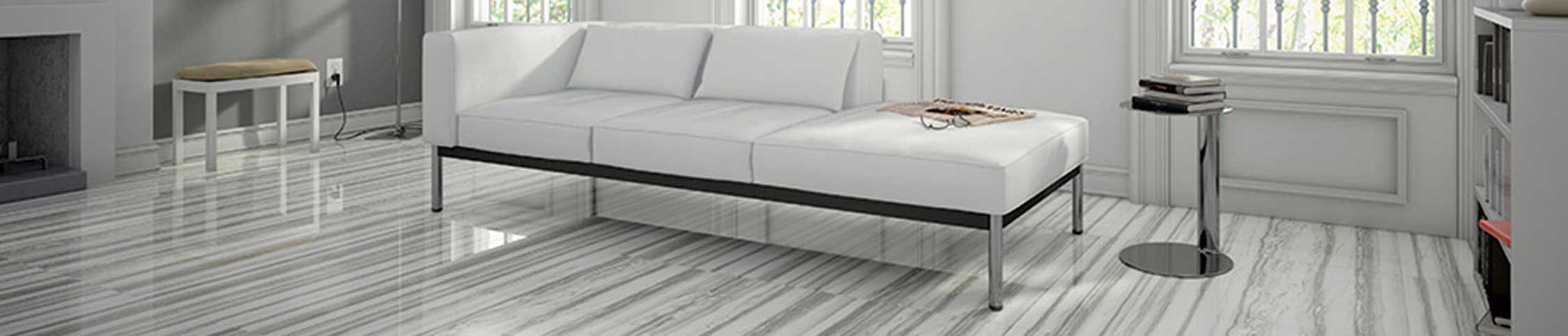
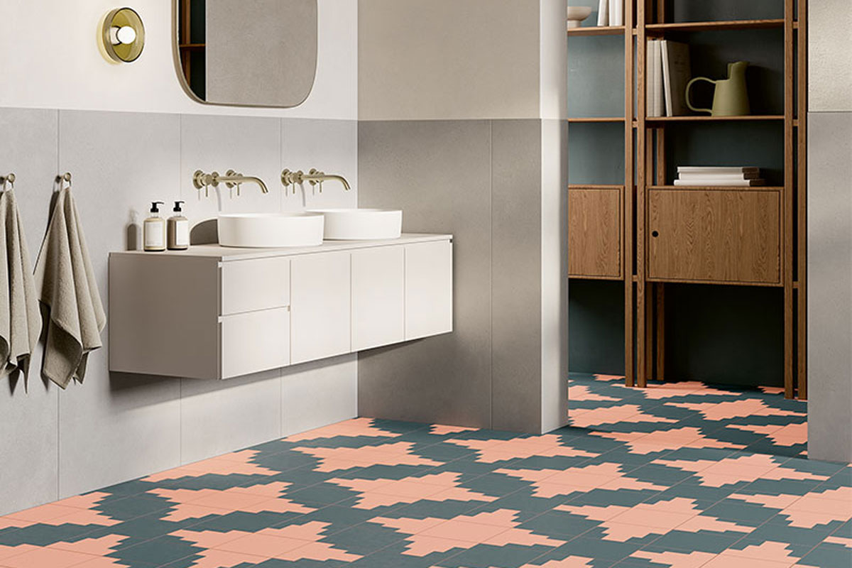
Warm and Bright Spaces
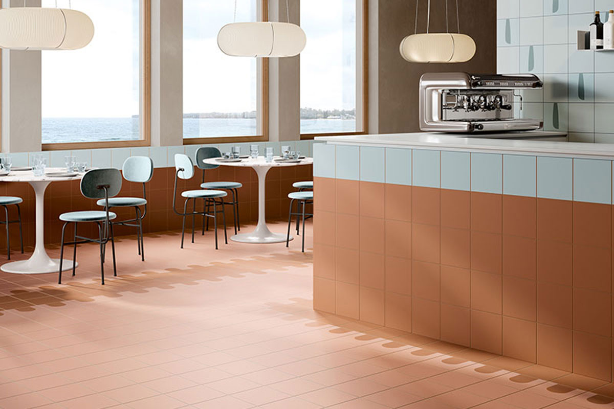
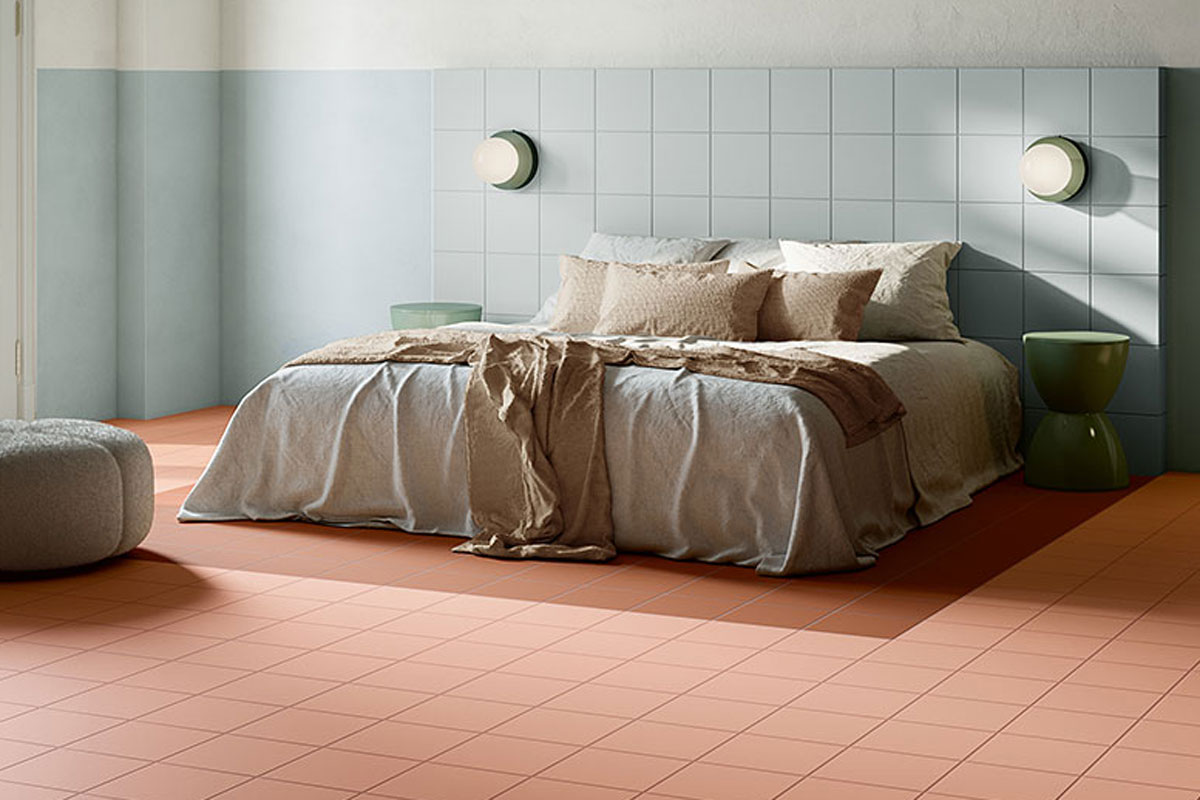
Fioranese has quickly embraced the allure of this year’s color, unveiling collections that masterfully reflect the emerging trend. Among these, a variety of selections offer pastel hues that align flawlessly with the Color of the Year, alongside complementary colors that enhance the brightness and warmth of any room, infusing each space with refined elegance and a sense of openness. A highlight in their offerings is the ‘Italian Landscape’ porcelain stoneware collection, a result of the partnership between Fioranese and the 23Bassi architecture studio. This collection draws its inspiration from a profound appreciation of Italy and its vast cultural wealth, inspiring a fresh viewpoint and encouraging a new perspective. It focuses on three emblematic Italian cities – Florence, L’Aquila, and Siena – each a symbol of Italian art’s global significance.
The Italian Landscape collection features an array of exquisite pastel tones available in unique shapes, allowing for a myriad of graphic arrangements. It stands as an ideal choice for integrating and harmonizing interiors with the year’s chosen color. Conversely, the ‘I Variegati’ collection, especially in its powder variation, lends a modern sophistication to Peach Fuzz, inspired by an innovative reinterpretation of traditional terracotta. This collection marries the textural allure and historical depth of variegated terracotta—a testament to Italian craftsmanship—with the precision of contemporary manufacturing techniques, creating an unparalleled product that merges traditional aesthetics with modern performance. The collection is marked by its geometric and decorative patterns, offering a marble-like texture.
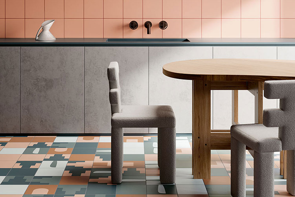
For those looking to incorporate Peach Fuzz into their design scheme, the ‘Fio.Biscuit’ collection presents a compelling option. This collection offers a modern take on classic hues, infusing spaces with personality yet maintaining a contemporary vibe. It is the culmination of meticulous research into shapes and colors, bridging traditional and modern design elements. Explore the soft-touch matte colors of ‘Fio.Biscuit’ to craft spaces that are not only unique but also perfectly aligned with the Pantone Color of the Year.